Putting a Microscope to the Segoe Typefaces
 Monday, October 11, 2010 at 8:30PM
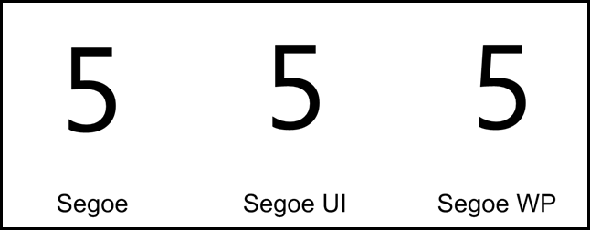
 Not extremely well publicized is that the release of Windows Phone 7 introduces a new typeface: Segoe WP.
I’ve am a big fan of Segoe UI but I have to admit Segoe WP is now my new favorite in terms of look – but still Segoe UI is the best choice for your day-to-day usage. I’ll spend the rest of this post going exploring how these typefaces compare and the issues you can expect to encounter when using them.
A quick recap
NOTE: Click on the images (the ones with black border) to see more detailed bitmaps.
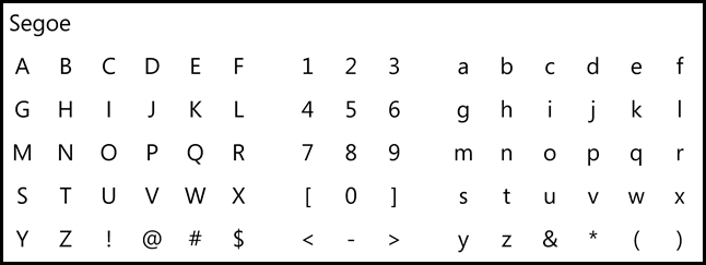
SEGOE
This is the the original. Wikipedia has decent coverage on the origin and controversies of this typeface. This font is not typically available for use. Most of Microsoft’s official printed materials, advertisements, and logotypes seem to use this typeface, but it isn’t distributed via Windows or freely available. So this is not common to encounter in the wild.
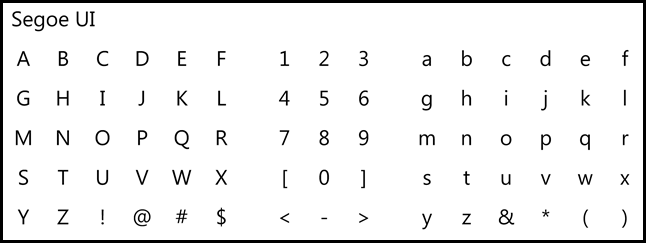
SEGOE UI
This one is all over the place due to Office 2007 and 2010 and Windows 7.
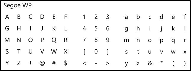
SEGOE WP
This is the new one with Windows Phone 7. It ships in the Windows Phone 7 SDK.
Rendering with ClearType
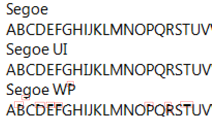
Microsoft Word 2010 at 100% zoom
Windows 7 – ClearType enabled using Word 2010 at 100% zoom.

You can easily see some weird artifacts in Segoe WP at 11pt.
Visio 2007 at 100% Zoom
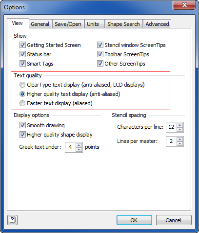
Before we look at how it displays in Visio, you have to know that Visio lets you pick how text is displayed. I’ll be obvious in a moment why I always choose “Higher quality text display (anti-aliased)” instead of the other options.
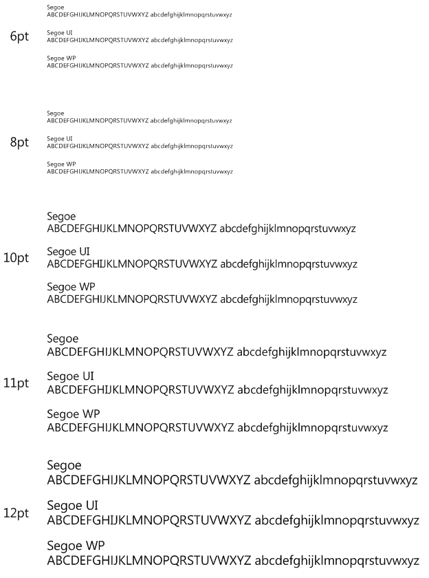
Visio 2007 (Higher quality setting)
Everybody looks great in this mode.
Visio 2007 (Cleartype setting)
We see some similar problems to what we found in Microsoft Word 2010.
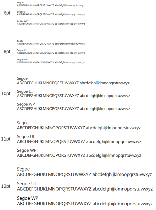
Visio 2007 (aliased)
Of course all three will suffer in this mode, but notice that Segoe WP fares the worst. Also I was surprised how well Segoe UI did overall. In particular the 10pt Segoe UI looks excellent.

PowerPoint 2010 at 100% Zoom
Same as Word 2010
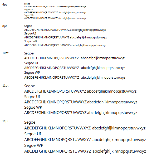
Internet Explorer 9 Beta (running on Windows 7)
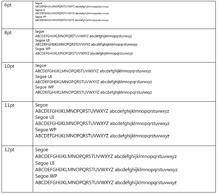
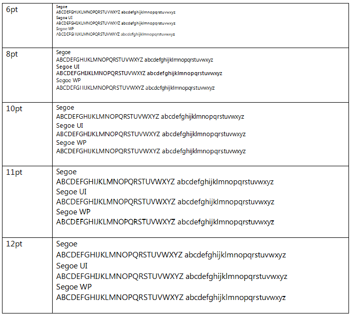
Google Chrome 6
Differences in Form
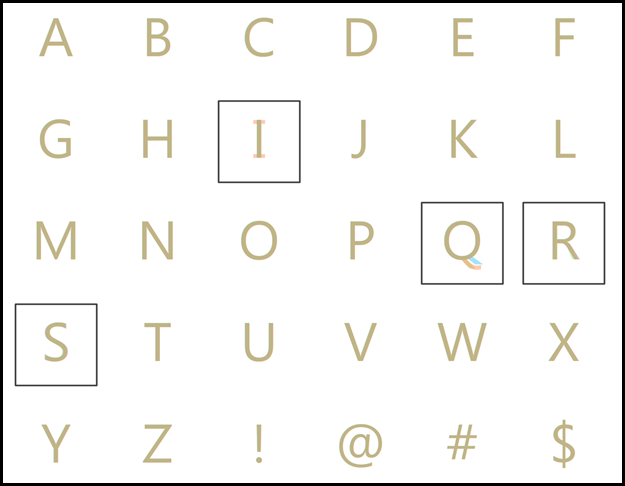
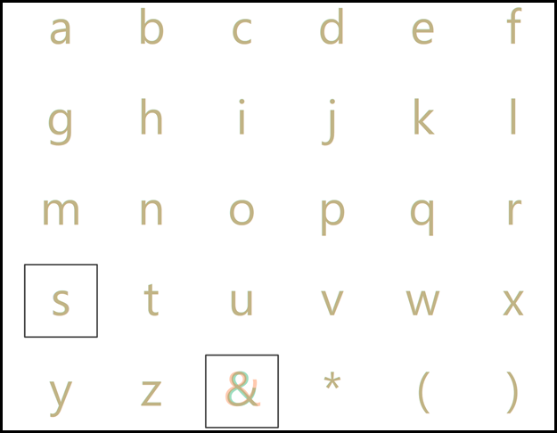
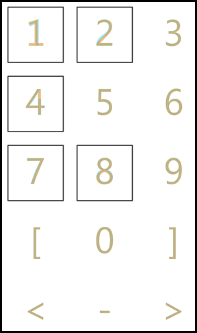
I’ve placed the letters from all three typefaces so you can compare directly how the shapes change. Segoe is in light green, Segoe UI in orange, and Segoe WP in blue. Wherever they all three overlap it will be seen as this brown color.
The full comparison chart is available as a PDF:
Highlights
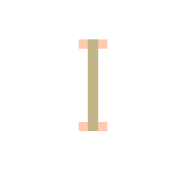
The capital I is the only thing I truly dislike about Segoe UI.
Some interesting variations in the capital Q.

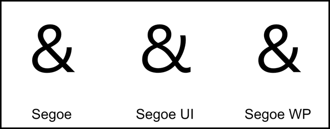
The ampersand exhibits the most divergence.
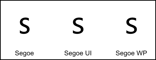
Minor differences in the lowercase s.


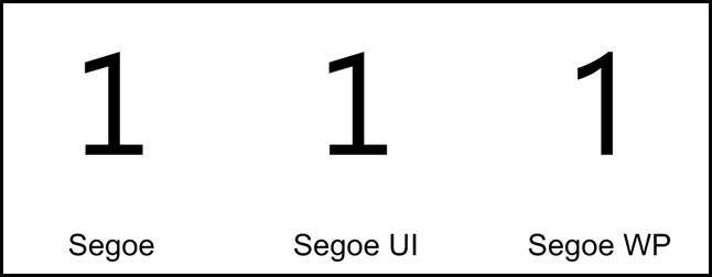
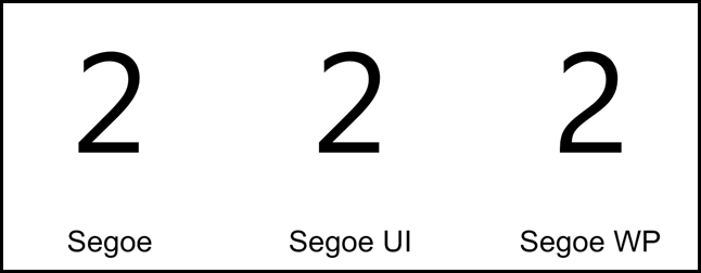
Segoe WP has a charming 2.

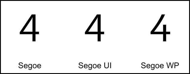
And a cute 4.

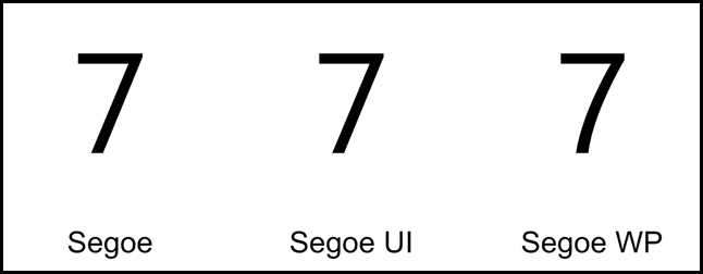
The gentle curve of 7 is Segoe WP is very attractive.


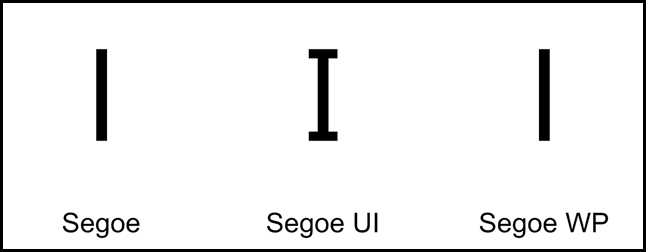
A nitpick on Microsoft Office’s Font picking UI
The image speaks for itself. I look forward to the day I can see these fonts rendered correctly. The Segoe WP light name isn’t even legible.
CONCLUSION
- Segoe WP is a really nice looking font but I can’t recommend using it outside of Windows Phone 7 scenarios due to the rendering issues you’ll encounter with ClearType.
- Segoe UI continues to be the best choice.
 saveenr |
  4 Comments |







Reader Comments (4)
The reason for the issues with Segoe WP at small sizes is because unlike Segoe UI, it is not hinted for smaller sizes. Windows Phone uses a DPI of 226 and so even at its smallest size used on the phone (14pt I think) it displays without the need of pixel grid hinting.
Great post, it's nice to see a detailed comparison of these fonts. Even this much later, it's hard to find any decent side-by-sides.
You seem to be having trouble with your font rendering. I've used all 3 fonts at very small sizes and have no issues at all. I have noticed that in the steam pixelvision skin, it says that directwrite is required for segoe wp; perhaps this has something to do with it. On the other hand, all 3 fonts render like crap at small sizes in your examples, so maybe it's just a problem with your computer.
@Anonymous - I definitely believe there may be an interaction with the hardware - though I don't think it was unique to my machine as I tried this on several computers (different manufacturers and graphics hardware) with the same/similar results. Having said that - I just now tried it with Windows 8 and Microsoft Word 2013 on a machine with a very weak graphics card and the results at small sizes look much better.